My Beginning Digital Painting – Day 1

I’m following digital drawing. These pictures are lined art and colored by Photoshop.
I’m learning by myself through websites. Any comments are appreciated.
Sources:
- http://www.squidoo.com/basicdrawingonphotosho
Working with layers
 In
terms of digital drawing, layers are your best friends. They are your
family, your pet, your boyfriend, your girlfriend, your everything. Your
life would be a nightmare without them. I can't emphasize this enough.
You may think I'm exaggerating, but believe me when I say your digital
drawing experience wouldn't be the same without them.
In
terms of digital drawing, layers are your best friends. They are your
family, your pet, your boyfriend, your girlfriend, your everything. Your
life would be a nightmare without them. I can't emphasize this enough.
You may think I'm exaggerating, but believe me when I say your digital
drawing experience wouldn't be the same without them.But what are they? I believe that the only way to really understanding layers is by using them. Still, this is what I can explain about them: Layers are levels that you create while making a drawing. The total of layers make your whole drawing, but each one holds a little bit of it, making it easier to work and move a particular part, without disturbing the rest of the image.
Don't worry if you don't understand anything yet. Once you start using them, it will all become clearer.
These are the sort of layer you'll find while working:

Background: Background: This is the layer by default in every new document that you create. Its contents can be set in the New window (File > New), and that means choosing between a white, other color and transparent background. You may notice a little lock at its right, that usually comes with this sort of layers but I'll say more about it soon.

General Layer: This is the one you'll probably use the most. You can put anything in it, applied any effect you want and move around. They are by default transparent.

Text Layer: TText Layer: This layer contains changeable text. By this I mean that it's a text that you can alter its content and format freely. Text layers are created on empty general layers. If there isn't one already on your panel, it creates one that then turns it into a Text one. They can also have effects applied on them and be moved around, but they can me merged. To do so, you need to change them into general layers by rasterizing them. Once you do so, the text and format will be forever fixed. (view Layer Actions)

Group: Group: Joins several layers (general and/or text) in a folder so they can be selected, moved and altered as one, while still remaining separate inside the group. It also allows you to have group inside groups. This is a vital tool with working with massive multilayer drawings.
Other useful elements of the Layer panel:
 This sets the blending mode of the layer. It creates very interesting
effects in photography but we will use very few of them while drawing.
 Makes a layer translucent. The difference between Opacity and Fill is
that the first affects the whole layer, while the other just on the
contents (not the effects)
 Lock different aspects of the layer (Transparent pixels, Image pixels,
position) or all of them. Background will be fixed in all three of them,
but other layers can be locked and unlocked on convenience.
 Specify if the layer is visible or not. If you click on it, the layer would be made invisible.
 Links layers so they can be transformed and/or moved together. Other
changes like Styles and such will still be applied individually to each
layer and the link can be removed at any time.
 They produced different (very interesting) effects on the content of
the layers, such as adding shadows, borders or glow. They can be applied
by clicking on this icon or double clicking on the right side of the
layer.
 Creates a new Group
 Creates a new Layer
 Deletes selected elements (layers and/or groups)
Some actions that can be applied on layers:
Duplicate Layer: Duplicate Layer: As simple as it sounds: it creates a replica of the selected element or elements. You can choose where this new layer is created: the current file, a new one or other already open. It works on all sorts of layers.
Rasterize Layer: It converts text layers, among others, into general ones. But be careful, once you do it the text will be fixed, so make sure you are happy with the way it looks, before rasterizing.
Copy, Paste and Clear Layer Style: Copy, Paste and Clear Layer Style: When using styles, sometimes you want the same effect in several layers. One of the easiest ways to achieve it it's by copying and pasting said style. The Clear option will remove a layer's style.
Merge: Merge: It will fuse layers together, making them one. It works in all layers, except text ones. Styled layers will have the style become part of the content instead of a removable option, so be careful with those.
Flatten: Works much like Merge but instead of fusing selected layers, it will merge the whole image into one background layer.
Getting to know the Tool Boox
 Let
me tell you something about the tools we will use to make our drawings.
Some tools have different variations from which you can choose. One of
the ways of seeing this variation is in a menu that appears by clicking
the right mouse button on the tool.
Let
me tell you something about the tools we will use to make our drawings.
Some tools have different variations from which you can choose. One of
the ways of seeing this variation is in a menu that appears by clicking
the right mouse button on the tool.Now, you may notice that I leave a lot of tools unmentioned. This is because I don't generally use them. However, I urge you to explore and experiment with the different implements; find your unique way of doing things. This is not because I think badly of the way I operate, but because there are tools that I dislike that you may find very useful. Each person's way to do things is as one of a kind as the person itself, so take this more as base guides that later you can enrich with your own experience.
 Rectangular Marquee:
 This is a selection tool. It selects an area of
your canvas so you can apply changes to it without altering the rest of
the work. You can use this selection on several layers, either by
switching them or by selecting a few of them at the same time. This
won't affect your selection. Within this tool you can also find several
other shapes to make selections, like elliptical, row and column.
Rectangular Marquee:
Rectangular Marquee: This is a selection tool. It selects an area of
your canvas so you can apply changes to it without altering the rest of
the work. You can use this selection on several layers, either by
switching them or by selecting a few of them at the same time. This
won't affect your selection. Within this tool you can also find several
other shapes to make selections, like elliptical, row and column. Move:
Yes, this is a moving tool. It takes elements from one point to the
other. It can also move selected areas. Actually, unless you select a
particular area, it'll move the whole current layer. Or several layers
even, if they are selected. It won't move the background layer, but yes
selected parts of it.
 Crop:
Cuts out a defined canvas area, deleting the rest. It can be fixed to a
size and resolution but you won't be able to do anything else while
using it.
 Brush: this freehand tool holds a wide range of uses. If you have a tablet
 Eraser: Much like a brush but instead of creating, it removes. But use the same shapes, options and panel that the Brush tool.
 Paint Bucket:
 Paints a one colored area or a selection of it. It can
use both color and pattern (a bunch of them come from Photoshop, but
they are also very downloadable on the net).
Paint Bucket:
Paint Bucket: Paints a one colored area or a selection of it. It can
use both color and pattern (a bunch of them come from Photoshop, but
they are also very downloadable on the net). Gradient Tool
that works similarly to the Paint Bucket but instead of using one
color; it paints in a combination of two or more colors. You have a
couple of combinations by default, but you can also create new ones by
choosing two colors (one Foreground and other Background). They'll
automatically appear as a gradient.
 Pen Tool:This
is a favourite of mine that we will use quite a bit, I'll even explain
step by step how to use it, so I'll keep it short here. With Pen you can
create paths (like lines) that then you can outline, paint or select.
It works fantastically well at making curves and if you don't have a
tablet, this is the second greatest thing.
 Horizontal Type:
 This is the most common tool to add horizontal text.
You can change it, transform it, do whatever you want. For further text
formatting, you have both the Character panel and the Paragraph one.
Vertical text can be dealt with the Vertical Type, with pretty much the same change possibilities.
Horizontal Type:
Horizontal Type: This is the most common tool to add horizontal text.
You can change it, transform it, do whatever you want. For further text
formatting, you have both the Character panel and the Paragraph one.
Vertical text can be dealt with the Vertical Type, with pretty much the same change possibilities. Rectangular Tool:
Creates paths in certain shapes, rectangular in this case, but also
ellipses, polygon, etc. Much like shapes created by the Pen Tool, this
paths can be outlined, painted or selected, among other.
 Path Selection: It allows you to select paths, move or modify them
 Eyedropper: This is an interesting tool that allows you to choose a color from your canvas and make it your foreground or background.
 Zoom Tool:
As you may imagine, this zooms in and out of a particular area of your
canvas. I don't think it needs an explanation, but it's definitely worth
a mention.
 Color Selecting Box:
This displays the current foreground and background colors and allows
you choose different ones by clicking on them. The Default colors are
black as foreground and white as background, you can return to them
automatically by pressing the little icon at its left lower corner. The
arrow icon at the upper right corner will swap background for foreground
and vice versa.
 Other Functions
These are functions that are useful in drawing, so I thought I should introduce them.
Copy Merged (Edit > Copy Merged)
This allows you to copy a certain selected area of the canvas, exactly as you see it. When pasted, it will only appear as a one layered image, regardless of how many layers compose that part of the drawing.
Stroke (Edit > Stroke)
It will create an outline for a selected area. Unlike the similar option in Layer Style, you can choose only to stroke a particular part of a layer. Or even create the outline in a different one.
Transform (Edit > Transform)
It will allow you apply different transformations to a selected area, like size, rotation, distort and the like. Even better is the fact that it can also transform paths, saving yourself some quality issues that sometimes arise with transforming finished shapes. Try always (particularly on rotating, sizing or flipping), as far as you can, to transform the path rather than the resulting object. Sometimes it's alright either way, but better being on the safe side.
Image Size (Image > Image Size)*
This will change the size of your image as a whole retaining its shape parameters. It also allows you to change the image's resolution (DPI)
Canvas Size (Image > Canvas Size)*
Although this also deals with size, it'll only affect the one of the canvas, without affecting the image.
Common issues about size
One of the first questions we face
before actually starting our drawing is 'What am I going to do with
this?' We can start by deciding on whether it's meant for printing or
digital viewing. And this is a HUGE difference.
Objects on the screen differ from print ones; an image that looks absolutely great on the computer may look awful after printing, so, if printing is your objective, you have to take care of selecting the right size and resolution before making your drawing. Image Size provides us with all the information we need in that account, being able to change sizes in inches, centimetres or whatever measure is use in your country. A high resolution is also a must or you'll end up with a fuzzy or pixelated image. About 200 or 300 dpi is generally accepted by most printers as a good resolution. If you're planning on using your drawing on Cafepress or Zazzle, that is about the right resolution to use.
If printing is not on your mind then a lower resolution will be alright. I think 72 dpi is usually the default amount and I generally don't bother to change it unless in printing cases. Higher resolution images are heavier so unless needed, I wouldn't bother with the extra weight.
Now this is important:
* Always
change your base image to the size you want the drawing to be when
finished. Try not to shrink them unless you absolute have to and never enlarge them. Resolution should also be set before starting; changing it later will cause your image to change sizes.
Making the drawing, step 1: Preparing the base
 Now that we seem to have covered the basics about Photoshop tools and functions, let's start with the drawing.
As I said before, I been assuming all along that you already can draw, and this is when this becomes crucial because we will need a pencil (or whatever you use) sketch to use as a guide. A scanned one is ideal, but a photo will work too.
That one is mine. I scanned it, cropped out whatever I didn't want and play a bit around to make it clearer (see Tips and Tricks to learn how), now it's the time to fix sizes and resolution.
Let's say I want to print this as a present to a friend. My image is 600px wide and 768px tall at 300 dpi resolution. It's a nice size and a perfect resolution but I want it bigger so I change it to 923px wide and 1181px tall. Now you'll say 'But you said never to enlarge them!!' I did and I won't go back. But the main reason I'm so fiercely against enlarging images is that the resulting product usually looks blurry, pixelated or both. But here we're just working with a base image that won't appear in the actual drawing, so blurriness and pixilation doesn't matter at this point. This is why, regardless of the size of your original drawing, this is the moment to fix the pixel dimension.
Once you have your base ready in one tidy Background layer, it's time to start the line art.
Making the drawing, step 2: Line art
 To
make the drawing's line art we will use the Pen Tool, Ellipse Tool and
Brushes. Our objective is to create a path line along the same lines of
your drawing so them we can make an outline.
To
make the drawing's line art we will use the Pen Tool, Ellipse Tool and
Brushes. Our objective is to create a path line along the same lines of
your drawing so them we can make an outline.You'll notice that the drawing I'm using looks paler. This is because I reduced the opacity so I could show you the paths clearer. You don't need to do it, but if you want to, all you have to do is duplicate your Background Layer, made it invisible and then change the opacity on the duplicate.
1. Let's start with Pen tool. First make sure this
 in the upper bar or you won't be making any paths at all.
2. Choose a line to start. I'm going for the hair. Notice that is composed by two separate lines, one that shape the head and other as a fringe. We will come to that later.
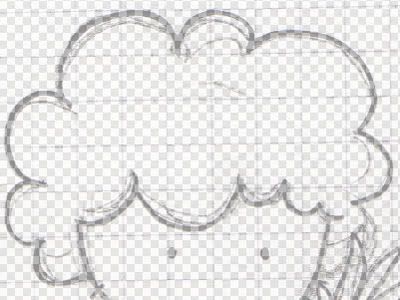
3. Making a close up go to one of the ends of your line and make a click on it with the Pen Tool. You'll see a dot appear which is called Anchor Point.
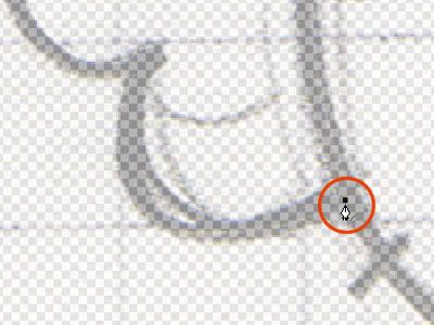
4. Now click again further along your drawing, but this time keep the mouse button press. A line will appear. Every time you need a straight line, this is all you have to do, so you can let go of the mouse. This is not the case here, so we'll move on.
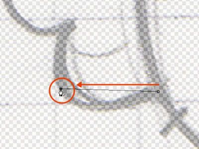
5. While still pressing the mouse button, drag the cursor to one side. This will make lines come out of the Anchor Point called Tangent Lines. By moving Tangent Lines around you can give shape to your path lines. We make the curve coincide somewhat with the one in our original drawing.
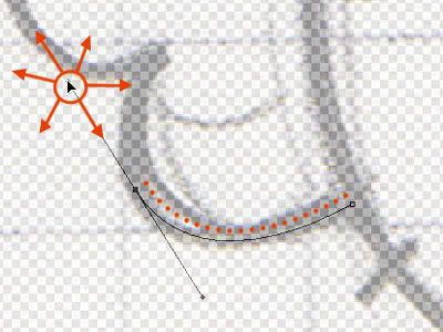
6. When making a curve always think that it needs three Anchor Points. When you make a curved path with the first two, the path that follows the third will always comply that curve. Here you can see how by clicking at the end of that particular round segment, the line that appears is automatically curve. This is something you always have to take into account when creating curved paths.
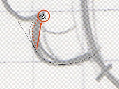
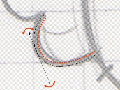
7. All done and you have a curve path, but Oh no! It's wonky! Fear not, by keeping press the Control key in your keyboard (or by using the Path selection directly) you can click on the Tangent Lines and move them the around, changing the curve. Try making them smaller by taking them closer to the Anchor Point or bigger by taking them away. See what fits your drawing. If you only see one Tangent Line, click on the Anchor Point and the other will appear.
8. Now your third point becomes your first and you can start all over again until you finish the line, alternating, if you have to, curved lines and straight. Once a particular line is finished you have to continue with another, in my case, the fringe part of the hair. To be able to move over there, keep the Control Key pressed and click on any part of the canvas that is not Path. This will make all your Anchor Points and Tangent Lines disappear, but the line will remain and you'll be able to start with a fresh Anchor Point in a new line.
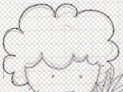
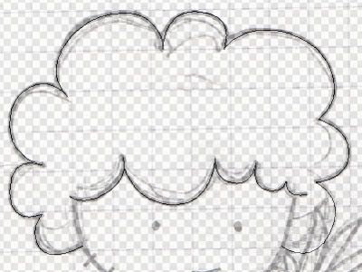
9. When you finish this second line repeat the Control pressing and Canvas clicking action. Now, you have two path lines. You can go back and modify any of your path lines by clicking on them with the Pen Tool pressing Control, but always remember to Control press and Canvas click after it, otherwise, any action you want to apply will only affect the 'active' path line instead of all of them.
*
You may notice that I should have left some empty spaces where the
lines of another segment of the drawing collide with the one I'm doing. I
usually don't, I prefer to let the lines flow and then erase the
unwanted bits. I should say that I also do different areas of the
drawing on separate layers ( in this case, for example, the head, the
body and the pineapple) not only to make the erasing simpler, but also
to be able to move them around If I'm not happy with how it looks. You
don't have to do it this way if it doesn't suit you. Just leave the
apertures in the path while creating it and then you don't have to worry
about colliding lines.
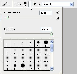
10. Now to the outline. Activate the Brush tool and select a round shaped brush of about the diameter you want your lines to be (you can select that both in the upper bar and on the Brushes panel). Next make sure the Foreground color is black (or whatever color you want your lines to be)
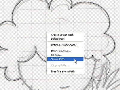
11. Finally go back to the Pen Tool and click with the right button. Select from the menu the Stroke Path option. When the window appears, select Brush and Accept.
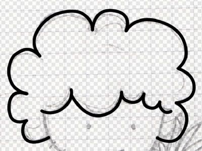
12. Yes! Now you have the first lines of your drawings. Now delete the already used path (by right click on canvas, select Delete Path) and keep doing the same with all the rest.
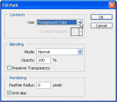
13. For the eyes we are going to make something a little different. Since we don't want to create an outline of them but a full shape, we'll use the Ellipse Tool to create a round path and then we choose Fill Path instead of the stroke option. We make sure the color is the one we want (it can be the Foreground or other) and then accept.
Making the drawing, step 3: Adding color.
 There
are a lot of ways to add color to your drawing. The one I'm going to
explain is one of the simpler ones, not only in performance level but
also in the matter of drawing complexity. Now, without few exceptions,
my drawings are the cartoony sort that generally doesn't need a lot of
coloring difficulty beyond plain colors. If this is also your case,
you'll be alright with this. If not, consider it the first step in your
coloring technique ladder.
There
are a lot of ways to add color to your drawing. The one I'm going to
explain is one of the simpler ones, not only in performance level but
also in the matter of drawing complexity. Now, without few exceptions,
my drawings are the cartoony sort that generally doesn't need a lot of
coloring difficulty beyond plain colors. If this is also your case,
you'll be alright with this. If not, consider it the first step in your
coloring technique ladder.Now, adding color is easier and quicker once you have conquered the ways of creating Path. But the first thing you should you is check your layers. The colors are going to be under the lines, and if you have multiple layers, it can get messy. So make sure that the line art is in one layer, merge if you have to, and make the Background Layer invisible (you can delete it if you want to, I usually keep it but you won't really need it anymore). Create an empty layer between the line art and the invisible background. That's where the color is going to be, so make sure it's the one selected at this moment.
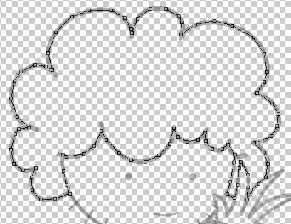
1. 1. Using the Pen Tool, create a path, much like you did before, around the area you want to paint. Since you have the line art on top, it really doesn't matter if you don't follow the line perfectly, all you have to care is that the path covers the whole area you want to paint and nothing of the outside. You don't even need to use curves; nobody is going to see the borders of the colored areas except yourself, so go crazy!
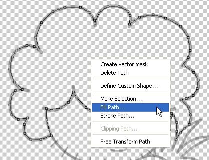
2. Choose as Foreground the color you want to paint that sector. Right-click on the canvas and choose the Fill Path Option.
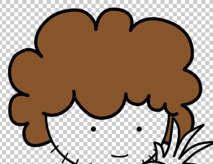
3. When the window opens just press Ok. Do the same with all the areas you want to paint and you'll be done in no time!
Making the drawing, step 3: Finishing touches.
You are almost there. Just finish your
drawing by adding a nice background or even some text. Remember that
this is as basic as you can get so investigate and experiment.
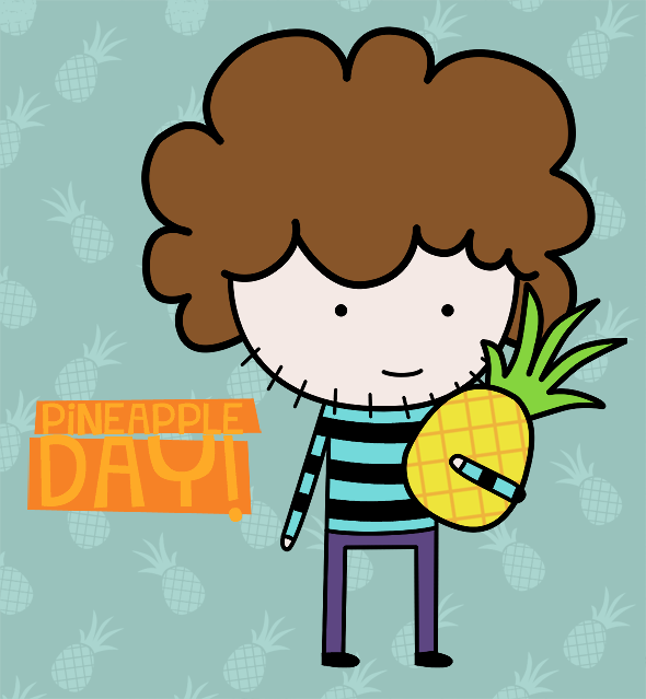
For mine, I made use of the existing pineapple and create a path with it and then shrunk and plastered it all over a
plain color layer to use as background. Then added some text and used
the Pen Tool to create rectangular shapes behind it. I uploaded the PSD
file* in case someone was interested in seeing it. It has all the
original layers, although the font layer will switch for a font
installed in your computer since you won't have the one I used. You can
find it here

For mine, I made use of the existing pineapple
Saving Formats
Among the humongous amount of file saving formats you're offered I always recommend to always sticking to three:
.PSD: This is a Photoshop extension and it can be opened by Photoshop and some other graphic editing programs. What is great about them is that it saves all you layer and work so you can continue working. But it's just a work-in-progress file.
.JPEG: Avoid unless you want to save a drawing of photographic quality. Or a photograph. Or you absolutely have to.
.PNG: This is our one. Line art, images with lots of text, drawings with fewer colors, all this and more can be perfectly saved with PNGs. Another huge advantage is that they'll keep the transparent parts of your drawing transparent, unlike JPEGs that will turn it white. On the downside, I'm told they are not supported by all Browsers.
Tips and Tricks
* To make your line art look better you can sharp it after you're done (Filter > Sharpen > Sharpen) It's not always necessary, but generally it'll give it a great look.
* To copy paths jjust press the right left mouse button while pressing Ctrl + Alt and drag it to one side. If you also press Shift the new path will only go parallel to the original path.
* To make a symmetrical shape path (rectangle, rounded rectangle, circle or custom shapes) press Shift while making them.
* An easy way to select all the elements of a layer is by clicking on said layer while pressing Control. If you want to add more elements from other layers to your selections, also press Shift. If you want to deselect, instead of Shift press Alt
- http://photoshopclassroom.wordpress.com/category/digital-painting/
Hey Friends
This is a tutorial for the beginners as we have been seeing many advanced tutorials till now i would like to start of with the simple and basic Photoshop coloring. I use a Photoshop CS4 this simple work can be done in any version of Photoshop.
Now we shall learn how to do this character !

- First Draw this cartoon character in an A4 size paper and using markers make a final hard copy
- Scan the copy and set the gray scale may be using simple picasa software so that the black out lines are clearly seen

- Now open Photoshop software and go to
- File > Open and select the file where you have stored the soft scanned character
Now Select the Color for the body of this Character from the color pallet
Now using the fill option fill the portion you want
Now similarly choose various colors and fill the other parts of the character
Now to give the yellow background choose the whiter background portion using the Magic tool from the tools option
- Now choose the Brush tool and select the color you want along with the brush size adjustments
- For Increasing the size of the brush use ” ] ” and to decrease the size use ” [ ” now make the background with one click
- To de-select the portion Press Ctrl + d
- Now save the image by using the File option > Save As >
- Type Filename and Format as JPG and press Save
An active Box may appear saying JPEG option Do the following settings and press Ok
Here is the final Out put

Am sure this tutorial would help you how to start off with Photoshop !
--------------------------------------------------------------------------------------------------------
Read more:
--------------------------------------------------------------------------------------------------------

No comments:
Post a Comment